Sunday, 31 January 2016

organisation - photography


This is some of the photos I have taken for my front cover. In all my photos I left room on both sides to give space for my conventions. I think I prefer the top picture for the pose and there is also a noticeable light difference which I prefer the darker image but I may change my mind when I put on my magazine.


This is some of the photos I have taken for my double page spread where I have my artist on the one side which leaves space for the other page where my text will be.   I prefer the two images whith my artist looking to side as if hes looking at the article and out of the two I prefer the top image as I like the pose.


For my contents page I still need to some more photos but as they are going to be close ups I could zoom in or just take new pictures. 

Wednesday, 27 January 2016

organisation - final photo plans

for my photo shoot in a couple of days time it is important i get it right as it is one the most important aspects of the magazine. i have already completed the types of poses i am going to make here:http://callumcarter17.blogspot.co.uk/2016/01/organisation-photo-plans_18.html but i decided   to do more on the day so i can have a wider range of choice. the clothes i am going to wear on the day are: vans (shoes), jeans ,a white shirt and a navy hoddy as it is the sort of casual clothes my genre of artists wear, i will take my photos in the school drama studio where there is black wall which will be a suitable background for my image.

Monday, 25 January 2016

drafting and planning

Today I have finished my layout for my double page spread with the exception of a picture on the left hand side. I have also completed a page of text on the right page which links to my main cover line. Finally I have slightly changed the font for my artist, you can see the original font I was going to have here:http://callumcarter17.blogspot.co.uk/2016/01/drafting-and-planning-potential-fonts.html

Sunday, 24 January 2016

drafting and planning - potential fonts.

these are my potential fonts for my cover line which will have my artist with the the album as an exclusive interview. i would definitely expect a slight colour change with a different layout but this is the sort of font style i want to use  with a slight difference with artist font as i had shown on my draft article.


Wednesday, 20 January 2016

drafting and planning - band names

for my music magazine i need a variety of bands/artists that will feature in my music magazine to help to appeal to a larger audience because if there is only one band and you don't like them then you wont buy the magazine. i have created a small list of potential names that i may add to. i may also use one of these for my main artist.  
The Berg Brothers
Electro energy
Laboto-7
Yansen
Käck
Das Electric
Stockholm service

Lazer party 

Monday, 18 January 2016

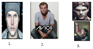
organisation - photo plans


when i am completing my photography for my magazine these images are the types of poses and camera shots i would ideally like to use. i have taken these images from my draft which can be found here http://callumcarter17.blogspot.co.uk/2016/01/drafting-and-planning-first-draft.html.

1. this is my front cover which is a medium close up looking directly at the camera. 
2. this is my double page spread which is a long shot and again looking directly at the camera,
3. these images are for my contents page which contain a close up and a medium close up with one image not looking at the camera. 

Friday, 15 January 2016

drafting and planning - first draft updated.

http://callumcarter17.blogspot.co.uk/2015/12/drafting-and-planning-drafts.html  (original draft)
 I have decided to make some changes in terms of the colour and layout as  when i was trying to replicate my plan i had some difficulties.


my contents page has also had a change an i found this layout looked better than my original plan.

my double page spread has been kept the same but in different colour.


Thursday, 14 January 2016

drafting and planning - fonts


this is one of my more likely fonts i am going to use for my masthead. i like this font because it looks unique and it really links to my "electro" theme and as i am planning to call my magazine "shock" the bolts of lighting are used to show an electric shock. the colour of my font really depends on my background and as i plan for a dark background this colour wont work so i was thinking of a blue. This is just one font so i am likely to consider others and in different colours.

Tuesday, 12 January 2016

organisation - costume

for my music artist that will appear in my music magazine i have given more thought to what my artist (me) would be wearing. fitly for my front cover and contents page i am looking to have mid shots so the bottom half wont be visible. i am still looking to stick my idea of using sun glasses to give a more unique identity. i also what to use a simple top but i want to use a bright colour to make the artist stand out. one idea i had for top is i have a blue top with the number 78 on it and as i have no name for my artist i could maybe use 78 in the name with other music artists have used for example: deadmau5, wretch 32 and 50 cent. for the photo on my double page spread i plan to use a mid or a long shot so if i do pick the long-shot i will also be wearing jeans.

Sunday, 10 January 2016

research into similar products - music magazine for conventions.


this is a slightly different mix mag magazine as all the previous mix mag magazines i have viewed had a "busy" front page for example album advertisements. where as this front cover is more simplistic and only covers the essential conventions which include: masthead, cover line, sub cover lines, bar code  and price. this can help me because i do want to make a similar magazine to mix mag but i prefer a more simple layout but maybe one or two more conventions than this particular magazine front cover. 

Wednesday, 6 January 2016

drafting and planning - front cover


For my front cover of my music magazine I want it to be slightly unique with the layout however having looking at this music magazine “legacy” by mix mag it was my ideal and so far my favourite. What I want to use from this front cover is a similar colour scheme as it is different, the colours go well together and it links to an “electro” style. I also quite like the way the artist takes up half instead of all the page however I would prefer it with the artist at the tip so it can slightly cover the masthead for added effect. I also like the skyline but maybe in the same colour as the cover line. This magazine also covers the general features such as a bar code which I must have. The only thing I don’t like about this magazine front page is the way the “James zabiela” advertisement takes up a large space, I do think that it will be useful but it should be a lot smaller. 

Sunday, 3 January 2016

Drafting and planning – influences


Here I found a magazine contents page from “kerrang” although kerrang is not related to my genre of music I still look at different magazines for ideas but more for layout then content. In my first draft for my music magazine the contents page is very similar to this one as this magazine has influenced me with the photography kept mostly in the top half with the text mainly in the second half beneath the photography. Having researched a wide range of music magazines I only saw this particular layout occur in kerrang which shows it is unique. I like this idea and I think with more research into my genre I can convert this idea and be successful.

Friday, 1 January 2016

drafting and planning - influences

this is a double page spread from the magazine "Q" although this is not related to my genre in music i am still highly influenced when it comes to layout as i want to follow a similar pattern. i plan to have my artist on one page with a couple of features such as page number and artist name. and therefore my second page is for text relating to artist and cover line. however i think this double page has too much text which gives it a "busy" appearance. i also found that the use of the "L" was different and unique so i may plan to do something similar depending on my colour scheme.